
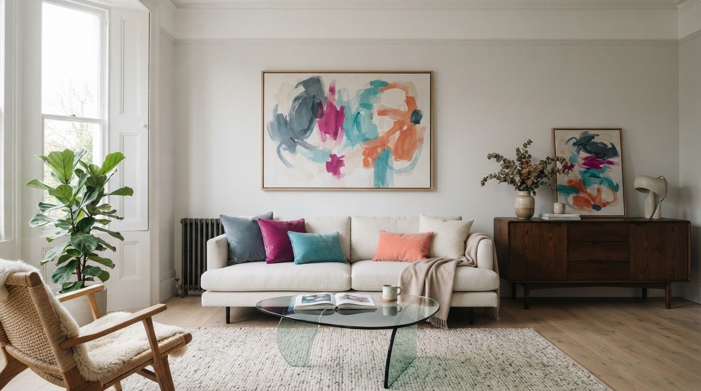
The right abstract canvas print can bring a room together without taking it over. Choosing abstract canvas prints can feel tricky when there’s no obvious subject to guide you. Colours, shapes and movement all matter, and it can be hard to picture how a design will sit with your furniture and décor.
You might be weighing up a bold piece against something quieter, or wondering whether a design will overwhelm the wall or fade into the background. You don’t need to be an art expert to choose well. Start with the mood you want, then consider the room’s colours, furnishings and available wall space. This guide will help you compare abstract canvas prints by colour, shape, composition and placement, so you can choose a design that suits your taste and feels at home in your space. You can then browse Panther Print’s handmade abstract canvas range with a clearer idea of what to look for.
Key Takeaways
- Choose a mood for the room, such as calm, lively or bold, to help focus your search.
- Compare the print’s colours and shapes with nearby décor, without expecting an exact match.
- Consider colour, contrast and composition together to help the artwork stand out without competing with the room.
- Check the wall, nearby furniture and everyday sightlines before choosing where the artwork will go.
- Browse Panther Print’s handmade abstract canvas prints with your preferred mood and palette in mind.
What abstract canvas prints bring to a room: colour, movement and mood
Abstract art uses colour, shape, line or texture as its subject, rather than showing a recognisable person, place or object. That gives you a different way to choose wall art: notice how the design makes you feel and how its elements work with the room. Abstract canvas prints can introduce colour, create a focal point or add a sense of movement. A quieter design can also sit comfortably in a room that already has plenty to catch the eye.
What makes a canvas print abstract?
Look at the visual ingredients. Crisp lines and repeated shapes can feel ordered, while curved forms may seem softer and more flowing. A design with just a few shapes and colours can feel minimal; expressive marks and layered-looking elements may appear more energetic. Abstract art takes many forms, from geometric designs to loose, richly detailed compositions. The Abstract art overview offers more background on the style and its history.
Try describing a design in everyday words. Does it feel calm, lively, balanced or bold? These first impressions help you compare artwork even when there’s no literal subject to identify.
How abstract art can shape a room’s mood
Think of the print as part of the room’s overall visual energy. Soft forms, related colours and restrained contrast may feel quiet beside simple furnishings. Strong colour differences, sharper shapes or energetic marks can draw the eye and bring a livelier accent. Neither approach is automatically better. It depends on the atmosphere you want and what’s already in the room.
Scale and composition matter too. A larger print with strong contrast can command attention, while a smaller or more restrained design may sit comfortably among other features. Open areas can give the eye a place to rest; a busier arrangement can add movement. A print might anchor the space above a sofa or take a quieter role alongside existing colours and furnishings.
Start with your own response, not a decorating rule. Picture the artwork on the intended wall and consider whether its colours and shapes support the atmosphere you want. If you enjoy looking at it and it feels at home in the room, you’re on the right track.
How to choose abstract canvas prints that feel like you
Start with your own taste, not a decorating trend. Before browsing, picture the feeling you want in the room: perhaps a calm corner, a lively splash of colour or a bold piece that catches the eye. Tate’s guide to colour, movement and mood is a useful reminder that visual elements affect how artwork comes across. Your own response is what matters most.
Start with the feeling you want the artwork to create
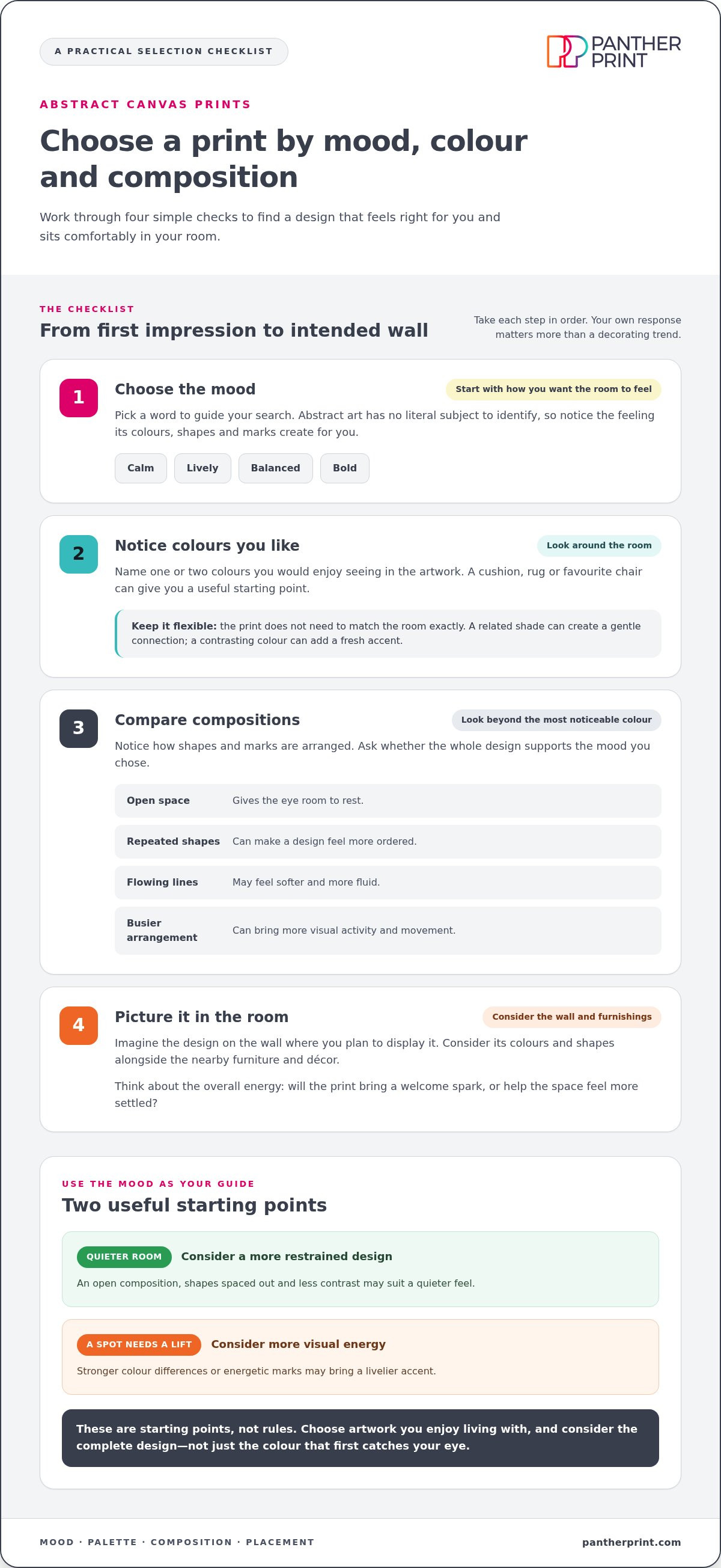
Use this simple four-step process to narrow your choices:
- 1. Choose a mood. Pick a word such as calm, lively, balanced or bold.
- 2. Notice colours you like. Look around the room and name one or two colours you’d enjoy seeing in the artwork.
- 3. Compare compositions. Decide whether you’re drawn to open space, repeated shapes, flowing lines or a busier arrangement.
- 4. Picture it in the room. Consider how the design might sit with the furnishings and the wall where you plan to display it.
For a quieter room, you might prefer an open composition with shapes spaced out and less contrast. If a spot needs a lift, a design with stronger colour differences or energetic marks may be a better fit. These are starting points, not rules. Choose artwork you enjoy living with rather than something that’s popular this season.
Use colour and composition to narrow your choices
Pick out one or two colours already in the room, perhaps from a cushion, rug or favourite chair. The artwork doesn’t need to match them exactly. A related shade can create a gentle connection, while a contrasting colour can add a fresh accent. Consider the whole palette, too: other colours in the print may help it feel at home among your furnishings.
Then look beyond the most noticeable colour. Repeated shapes can make a design feel more ordered; scattered marks may seem livelier. Open areas give the eye room to rest, while a fuller composition can bring more visual activity. Ask whether the complete design suits the mood you chose, not just whether one colour catches your attention.
With a mood, palette and composition in mind, you’ll have a clearer sense of what to look for. Browse handmade abstract canvas prints and compare designs for your home or office.
Are abstract canvas prints difficult to match? Balance colour and composition
They don’t have to be. Abstract canvas prints can suit many interiors when you consider colour, contrast and composition together. The aim isn’t to find an exact match for every cushion or wall colour. Instead, think about how the print’s overall energy relates to the room. Does it bring a welcome spark, or help the space feel more settled?
Should abstract art match your room’s colours exactly?
No exact match is needed. A shade that echoes a colour already in the room, perhaps in a rug or chair, can create a pleasing link even if it’s lighter or deeper. You could also choose a contrasting colour to add interest. Neither approach is essential. Consider the full palette alongside other visual details, such as patterned fabrics, dark furniture or decorative objects. MoMA’s explanation of balance, colour and composition offers a useful perspective on how visual elements work together.
Use the guide below to compare impressions, not as a strict matching formula. A restrained palette can still stand out through its shapes, while a high-contrast design may feel at home if the rest of the room gives it space.
| Design quality | It may feel | Consider it alongside |
|---|---|---|
| Restrained palette | Quiet or cohesive | Colourful furnishings, patterned accessories or a room where you want the art to sit gently |
| High-contrast palette | Bold or attention-grabbing | Quieter furnishings, or a wall with enough visual breathing space |
| Open composition | Airy or uncluttered | A busy room where a simpler arrangement could offer a pause for the eye |
| Busy composition | Active or layered | A simpler setting where the print can bring more movement and detail |
How do you balance a bold print with the rest of the room?
Compare the print’s colour intensity with the room’s most noticeable furnishings and accessories. If the artwork is vivid and full of movement, quieter pieces nearby can help it become a focal point without making the whole space feel crowded. In a colourful room, a print with a restrained palette or open composition may add interest without competing with everything around it.
Look at the wall as well as the artwork. A strong focal point can feel balanced when the surrounding wall and décor aren’t equally busy. There’s no single right combination, so consider what feels comfortable in your space. Use the table to narrow down what appeals to you, then picture the complete design alongside the room’s colours and furnishings.
Where to place abstract canvas art for a considered focal point
The right spot can help a print feel connected to the room, rather than simply filling an empty wall. Notice which walls catch your eye as you enter and where you naturally look while sitting, working or moving through the space. Then consider the wall’s role, nearby furniture and the colours around it.
Choose a wall that suits the artwork’s visual energy
A central wall can suit a lively composition if you want the artwork to draw attention. In a home office, a burst of colour might bring interest to the space where you work. A calmer design may feel more at ease on a wall already framed by shelves, patterned furnishings or other decorative details. Let the artwork’s visual energy work with the setting, not against it.
Think about what you want the print to do. Above a sofa, it might help anchor the seating area. On a quieter wall, it could add a welcome point of interest. If the room already has a clear feature, choose a position where the art adds something without crowding it.
Picture the canvas alongside furniture and everyday routines
Look at the print in relation to nearby furniture and the way you use the room. A canvas above a desk will be seen differently from one opposite the sofa, so check the view from the places where you spend time. Consider whether its main colours connect with a chair, rug or other furnishings, and whether the composition feels comfortable from across the room as well as close up.
Preview the intended position before settling on a design. Mark out the area on the wall with removable paper, then step back and view it from the doorway and your usual seat. This simple check can help you judge how the artwork will sit within the room, rather than relying on a quick glance at the design alone.
Keep the choice focused on placement and feeling here. For measurements and proportions, use the dedicated guide to choosing canvas print size for a room. Once you’ve settled on a wall and the mood you want, browse abstract canvas prints to find a design that feels at home in your space.
Find abstract canvas prints you’ll enjoy living with
You’ve now got a simple way to make your choice: settle on the mood you want, notice which colours appeal to you, compare the composition and picture the artwork in its intended spot. This gives you a personal starting point, without needing to follow a trend or match every detail in the room.
A quick checklist before choosing your abstract canvas
Before deciding, pause and ask yourself:
- Does it suit the room’s mood? Consider whether the design feels calm, lively, balanced or bold in the space where you plan to enjoy it.
- Does it sit comfortably with your décor? Compare its colours and visual energy with the furnishings and details nearby.
- Can you picture living with it? Imagine seeing the composition as part of your everyday surroundings, not just on a screen.
If a design catches your eye but you’re unsure, picture it on the wall and consider the feeling you want it to bring. Seeing the artwork in that context can help you decide whether it feels right for your home or office.
Browse abstract canvas art by the look you love
Panther Print’s handmade abstract canvas prints offer a way to bring colour, movement or a focal point into your space. Take your time comparing the designs. Notice which palettes appeal to you, how each composition feels and which one you can imagine seeing day after day.
There’s no single perfect choice for every room. The right design is one you enjoy and can picture feeling at home in your space. Browse Panther Print’s abstract canvas prints and find artwork that feels like you.
Choose artwork that feels at home in your room
The right abstract canvas print brings together the mood you want, colours that sit comfortably with your décor and a composition that suits its intended spot. Trust your own eye: the design you’ll enjoy seeing every day matters more than following a trend or matching every shade exactly.
Panther Print’s handmade canvas wall art includes a dedicated range of abstract canvas prints for homes and offices. Browse the designs at your own pace and imagine how each might work in your space.
Browse abstract canvas prints and find a design you love. Your favourite could be the finishing touch your room needs.
Frequently Asked Questions
What is an abstract canvas print?
An abstract canvas print is artwork led by colour, shape, line or texture rather than a recognisable subject such as a person, place or object. Some designs use crisp geometric forms; others feature flowing marks or a more minimal arrangement. Look at how these elements work together and the impression they make. That gives you a useful starting point for choosing abstract canvas prints that suit your taste and room.
How do I choose an abstract canvas print for my living room?
Start with the atmosphere you want in your living room. For a quieter feel, you might prefer an open composition and restrained contrast; for a livelier accent, look for stronger colour differences or energetic shapes. Then consider the wall, nearby furniture and colours already in the space. Picture the complete design above or near your seating area, and choose the one you enjoy looking at.
Do abstract canvas prints suit traditional interiors?
Yes, abstract canvas prints can work well in traditional interiors. Look for a palette that relates to colours already in the room, or choose a composition that brings fresh contrast to classic furniture and details. A restrained design may sit quietly among patterned fabrics, while a bolder piece can add an unexpected focal point. There’s no need to follow a strict style rule; aim for a combination that feels balanced to you.
How do I match abstract art with my room’s colours?
You don’t need an exact colour match. Pick out one or two shades already present in the room, perhaps in a rug, cushion or chair, and see whether the artwork shares or complements them. Consider the full palette, not just its most noticeable colour. Contrast can add interest, while similar tones may create a gentler connection. Think about how the colours sit alongside the room’s furnishings and other visual details.
Can abstract canvas prints make a room feel larger or brighter?
A canvas print can influence how a room feels, but it won’t physically change its size or lighting. A composition with open space and lighter-looking colours may give the wall a more airy impression, while vivid colours can add energy and draw the eye. Consider the room’s natural light, wall colour and furnishings when choosing. Treat these effects as possibilities, not promises, and select artwork that feels comfortable in your space.
Where should I place an abstract canvas print?
Choose a wall where the artwork can be seen and feels connected to the room’s layout. Above a sofa, it can help anchor a seating area; near a desk, it can add visual interest to a work space. Check the view from your usual seat and from the doorway, then consider nearby furniture and décor. If you’re deciding on dimensions or proportions, refer to a dedicated guide to choosing canvas print size for your room.
What should I look for when buying abstract canvas prints online?
Look closely at the design’s composition, colour palette and visual energy, then picture it alongside your room’s furnishings. Read the product details for information such as the print’s dimensions and format, so you can decide whether it suits the wall you have in mind. Colours on screen can appear different from those in your room, so use the image as a guide rather than an exact colour match. Choose a design you’ll enjoy seeing every day.