
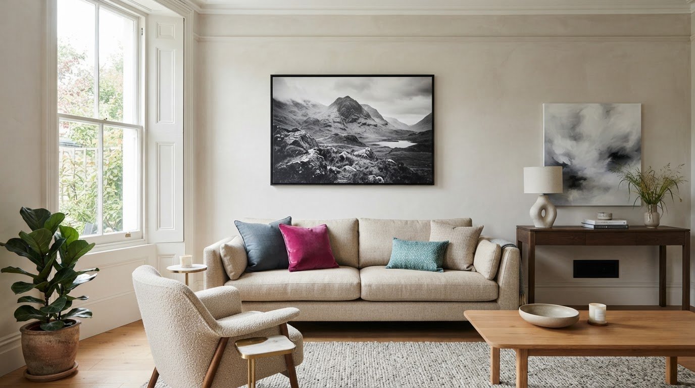
Choosing black and white canvas prints is less about picking the boldest image and more about finding the right balance of light and shade. A monochrome print can feel calm, dramatic or full of character, depending on its subject, contrast and position in the room.
If you’re worried black and white art might make your space feel stark or dull, look beyond the palette. A print with deep blacks and bright whites may stand out more than one with softer grey tones, while the subject and the wall around it also affect the overall impression. The right image should suit your taste and the mood you want at home.
This guide explains how tonal range, composition and placement influence the look of a canvas. You’ll find practical ways to compare images, choose a subject and judge the space a print will occupy. You can also weigh up ready-made artwork against turning a favourite personal photograph into canvas art.
Key Takeaways
- Black and white canvas prints can feel calm or bold, depending on their contrast and subject.
- Compare the darkest and lightest areas to judge an image’s detail and visual impact.
- Choose a mood and subject that suit your taste before deciding where the print will go.
- Furniture, wall colour and nearby objects all influence how prominent a canvas feels.
- Choose ready-made monochrome artwork or have a favourite personal photograph printed onto canvas.
What makes black and white canvas prints so effective?
Black and white canvas prints use black, white and the grey tones in between. Without colour, your eye can focus on details that might otherwise compete for attention: the curve of a face, the texture of a tree trunk, the sweep of a skyline or the balance of shapes in an abstract design.
Monochrome canvas art uses a limited palette to bring shape, texture and feeling into sharper focus. That doesn’t mean every print looks stark or serious. A sharply lit portrait can feel bold and dramatic, while misty hills in pale grey may feel gentle and reflective. An old family photograph can feel nostalgic; clean architectural lines can give a room a modern edge.
That range is part of the appeal. The different approaches behind the art of monochrome photography show how much an image can express without colour. Look beyond the palette and consider what the image draws your attention to, and how you want to feel in the room.
How does a monochrome palette change the feel of a room?
Strong black-and-white contrast can create a crisp, graphic focal point. Imagine a dark city silhouette against a pale sky above a simple sofa: the shapes are easy to read and give the wall energy. By comparison, a photograph with plenty of soft grey can feel quieter and less commanding, making it a natural fit for a reading corner or restful bedroom. The image, wall colour, furniture and light all contribute to the effect.
What subjects work well in black and white?
Start with a subject that means something to you, then consider what monochrome brings forward. Portraits draw attention to expression and light across a face. Street and architectural photography highlights lines, patterns and perspective. Landscapes can feel atmospheric when mist, clouds or shadows take centre stage, while abstract imagery makes contrast, texture and shape the main event.
Match the subject to the mood you’d like the room to have:
- For a lively focal point: choose a clear silhouette, striking portrait or graphic city scene.
- For a calmer feel: look for softer greys, open space and gentle light in a landscape or photograph.
- For a personal touch: choose a meaningful portrait or have a favourite photograph printed onto canvas.
Think about what you’ll enjoy seeing every day. A dramatic image can add character to a plain wall, while a familiar place or face can make a living room feel more personal. Panther Print’s handmade canvas wall art includes black and white prints, and you can also have a personal photograph printed onto canvas. The best choice isn’t necessarily the one with the boldest blacks; it’s the image whose subject and mood feel right for your space.
How contrast, grey tones and composition shape a canvas print
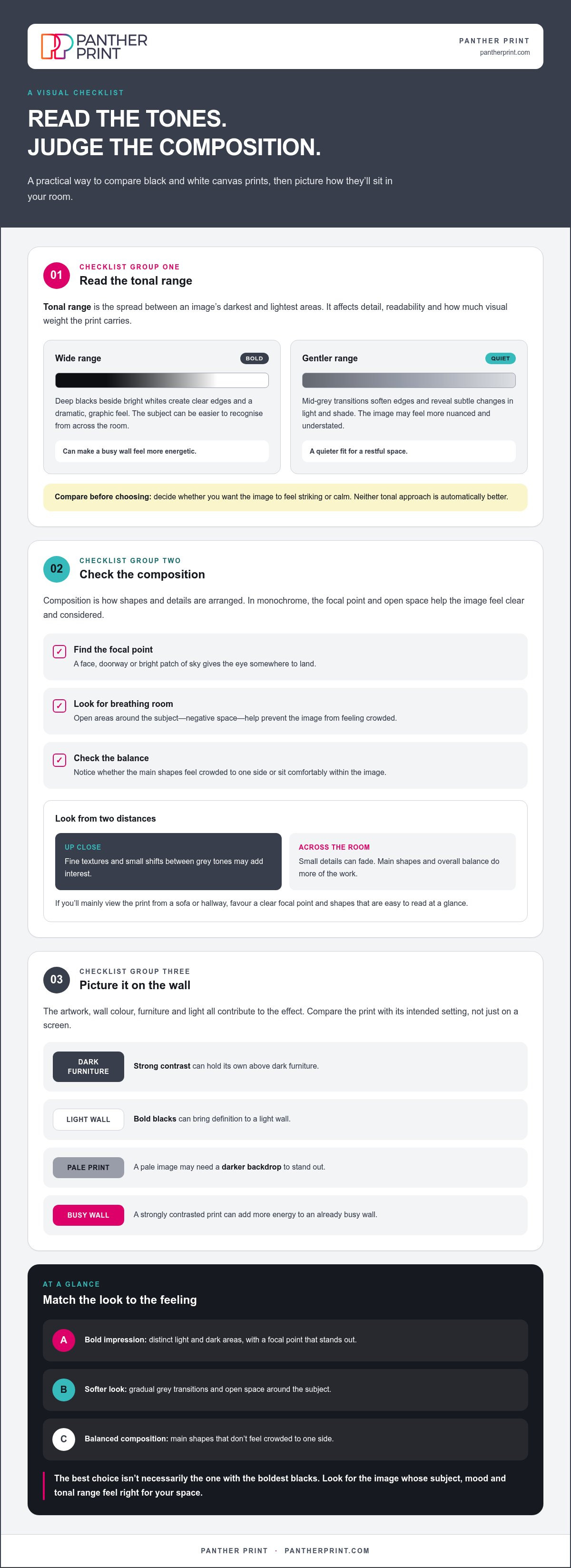
Tonal range is the spread between an image’s darkest and lightest areas. A narrow range means most tones sit around the middle greys; a wide range places deep blacks and bright whites side by side. This affects how clearly you can read the image, which details stand out and how much visual weight the print carries on a wall.
Tonal contrast shapes both the mood and readability of an image: sharper differences catch the eye, while gentler transitions invite a slower look. Neither approach is automatically better. Consider the wall and room as well as the image. Strong contrast can hold its own above dark furniture, while a quieter image may sit more gently in a restful space.
High contrast or soft greyscale: which look feels right?
Deep blacks beside bright whites create clear edges and a dramatic, graphic feel. That crisp separation can make a simple subject easy to recognise from across the room and give a print a strong focal point. It can also make an already busy wall feel more energetic.
Mid-grey transitions soften those edges. They reveal subtle changes in light and shade, giving a photograph a more nuanced, understated appearance. To choose, decide whether you want the image to feel striking or calm, then compare it with the wall and nearby furniture. A pale print may need a darker backdrop to stand out, while bold blacks can bring definition to a light wall.
Why do details and negative space matter?
Composition is the way shapes and details are arranged within an image. A strong focal point, such as a face, doorway or bright patch of sky, gives the eye somewhere to land. Open areas around the subject, called negative space, help prevent the image from feeling crowded. In monochrome, that breathing room can make a simple arrangement feel considered without relying on colour.
Look at the image from two distances. Up close, fine textures and small shifts between grey tones may add interest. From across the room, those details can fade, leaving the main shapes and overall balance to do the work. If you’ll mainly view the print from a sofa or hallway, favour a clear focal point and shapes that are easy to read at a glance.
- For a bold impression: look for distinct light and dark areas, with a focal point that stands out.
- For a softer look: choose gradual grey transitions and open space around the subject.
- For a balanced composition: check that the main shapes don’t feel crowded to one side.
Picture the artwork on its intended wall, not just on a screen. Explore Panther Print’s handmade canvas wall art with these tonal cues in mind, and compare the compositions that feel right for your space.
Will black and white canvas prints look too stark or too plain?
It’s a fair concern. A monochrome image with bold contrast can feel commanding, especially in a quiet room, but black and white isn’t one fixed look. The subject, tonal range and surrounding furnishings all shape its effect. A print that feels dramatic on a bare white wall may seem more settled beside a dark bookcase or warm, textured fabrics.
Don’t judge an image by its palette alone. Notice how much of the canvas is dark, how the lighter areas are arranged and whether the subject feels lively, peaceful or contemplative. These details help you decide whether it will add character or dominate the room.
What can make monochrome artwork feel severe?
Large, very dark areas beside bright whites can make an image feel forceful. A tightly packed composition with little open space may add to that intensity. If the print is also the strongest feature on the wall, it can dominate nearby furniture and décor. That isn’t a flaw in the artwork; it’s a reason to consider the balance you want in the room.
For example, a busy, high-contrast image may bring welcome energy to a simple hallway but feel overpowering above a patterned sofa. Consider the whole view, including nearby shapes and colours, rather than imagining the canvas on its own.
How can you create a softer, more welcoming effect?
Choose an image with more mid-grey tones, gentle light or breathing room around its subject. A landscape with a hazy horizon or a portrait with a relaxed expression may feel less forceful than a tightly cropped image with sharp light and shadow. A quieter composition can still have character; it simply gives the eye more room to wander.
If you love a bold image, balance it with its surroundings. Natural wood, soft furnishings and familiar decorative objects can help the wall feel lived-in rather than stark. You don’t need to match everything. A cushion or vase that picks up a colour already in the room can connect the artwork with the rest of the space.
Before choosing between the black and white canvas prints you’re considering, picture each one in the room at different times of day. Daylight on a bright wall may make white areas more prominent, while a shaded corner can bring dark tones forward. Consider:
- The room’s existing patterns: a quieter image may balance busy fabrics or wallpaper.
- The nearby materials: wood, linen and other soft textures can make a bold print feel more at home.
- The feeling you want: choose a lively focal point for energy, or gentle tones for a calmer atmosphere.
Monochrome art doesn’t belong to just one kind of room. Trust what feels comfortable in your space. If a striking image makes you smile, let it have presence; if you prefer a subtler look, choose softer tones and a more open composition. The aim is a canvas that feels like part of your home, not an interruption.
How to choose and place black and white canvas prints at home
Make the choice in stages. Decide how you want the room to feel, then pick a subject and tonal style that suit that mood. After that, consider the wall. This helps you avoid choosing an image you love in isolation but find too dominant, too small or out of place once it’s on display.
- Choose the mood: decide whether you want a restful note, a lively focal point or a clean, contemporary feel.
- Pick the subject and tones: find an image whose subject and balance of black, white and grey fit that mood.
- Assess the wall: consider its colour, the furniture below it, nearby objects and where you’ll usually view the artwork.
- Test the footprint: mark the intended shape on paper and hold it against the wall. Step back from the doorway or seating area to see how it reads at a glance.
Furniture gives useful context. Above a sofa or sideboard, a common starting point is to choose a piece around two-thirds the width of the furniture beneath it. Treat this as a guide, not a strict rule. A broad, open wall may suit a larger focal piece, while a narrow space between doorways may call for a more compact format. Measure the available wall space and consider viewing distance before settling on a size.
How do you match a print to the room?
Look at the room’s existing palette and decide whether the canvas should blend in or stand out. For a calm feel, a softly lit landscape can sit naturally among neutral furnishings. To make a more expressive statement, a close-up portrait with strong tonal differences can bring energy to a simple sitting room. For a contemporary touch, try an architectural image with clean lines against an uncluttered wall. Let the room’s purpose guide the mood, too.
Should you display one canvas or create a gallery wall?
A single canvas gives the eye one clear place to land, especially above furniture or on an otherwise open wall. Several images can bring rhythm to a larger area and tell a more personal story. Create a visual link between them, such as a shared subject, similar tonal range or even spacing. Before hanging the group, arrange paper outlines on the wall so you can adjust the layout and gaps.
Nearby objects matter as well. A dark lamp or shelf may echo the print’s deeper tones, while a pale wall can make those tones stand out more sharply. Look at the whole arrangement from the place where you’ll see it most. Explore black and white canvas prints, then use your paper outline to picture the format on your wall.
Explore black and white canvas prints and what to do next
You’ve seen how subject, tonal range and composition shape a monochrome image. Bring those choices together by considering the mood you want, how much contrast will suit the space and whether the wall and furnishings will help the artwork blend in or stand out. The right choice should feel connected to the room while retaining a character of its own.
There are two ways to make monochrome wall art personal. Choose a ready-made design with a subject that suits your taste, or make a favourite photograph the focus. Panther Print offers black and white prints and personalised photo-on-canvas printing, so you can choose a selected artwork or have a picture that matters to you reproduced on canvas.
Ready-made artwork or a personal photograph?
Themed artwork gives you a chosen subject, whether you’re drawn to a landscape, portrait or abstract design. A photo canvas starts with your own image, perhaps a family moment or a place you’d like to remember. Choose ready-made art for a decorative image selected for its look; choose a personal photograph when the memory behind it matters most. If you’d like a different visual direction, abstract canvas prints put shape and composition at the centre.
A simple final check before choosing
Before settling on a canvas, picture it in the room at its usual viewing distance. Consider the wall colour, furniture and nearby objects, then decide whether the dark and light areas suit the atmosphere you want. A paper outline can help you judge the space the canvas will occupy. Step back and view it from the doorway or the seat where you’ll see it most.
Use this quick checklist:
- Subject: does it feel meaningful or enjoyable to look at every day?
- Tonal style: do the blacks, whites and greys suit the room’s mood?
- Wall and décor: will the canvas sit comfortably with the colours, furniture and objects around it?
- Viewing distance: can you make out the main subject and composition from where you’ll usually see it?
There’s no need to overthink every detail. Trust the image that feels right for your space and taste. Explore Panther Print’s handmade canvas wall art, browse its black and white prints or personalise a photograph for canvas, then choose a look that feels at home on your wall.
Choose a piece that feels like yours
The right artwork doesn’t need to follow a rule or match every cushion. It should make you pause, remember something or simply enjoy the view as you pass through the room. Let that response guide your final choice. A canvas can also be a starting point for the space: pick a detail in the image and echo it with a cushion, a book or a small decorative accent.
Whether you’re drawn to a quiet scene or a more graphic statement, black and white canvas prints can bring a personal touch without requiring you to rethink the whole room. Panther Print’s black and white prints include ready-made artwork, and you can have personal photographs reproduced on canvas for a more individual connection.
Ready to find a piece that feels at home on your wall? Explore black and white canvas prints and find a look for your home. Trust your eye, choose what you enjoy and make the space your own.
Frequently Asked Questions
Do black and white canvas prints go with any colour scheme?
Black and white canvas prints can work with many colour schemes, but they’re not automatically right for every room. In a warm-toned space, try pairing the image with existing wood, cream or muted green accents; in a cooler scheme, navy, pale grey and metal details can feel at home. Rather than matching every item, repeat one colour from nearby furnishings in a small accessory. This creates a link without making the room feel overly coordinated.
Are black and white canvas prints still in style?
Yes. Their appeal comes from the image, shape and tone rather than a particular seasonal colour palette. That can make them easy to keep as your décor changes: update cushions, bedding or smaller accessories, and the canvas may still feel connected to the room. Whether it looks current or classic depends on the subject and surrounding space, so choose an image you’ll enjoy beyond a passing trend.
How do I choose between a high-contrast and a soft greyscale print?
Compare how each image reads from the distance at which you’ll usually view it. A high-contrast print is easy to recognise quickly, which can suit a hallway or a wall seen from across an open-plan room. Soft greyscale rewards a closer, longer look and may suit a reading nook. If you’re undecided, compare two options side by side at the same size on your screen.
Can black and white canvas prints make a room feel smaller?
They can: a very dark, visually busy canvas may make a small wall feel more enclosed, though the effect depends on its size and surroundings. To keep a compact room feeling open, choose an image with lighter areas and a clear subject. Avoid squeezing it between shelves or other large objects. A smaller canvas isn’t always the answer; leave enough visible wall around the artwork to give the arrangement breathing room.
Are black and white photo prints suitable for canvas?
Yes, a personal black and white photograph can work well on canvas. Choose an image where the main subject is easy to recognise and important details aren’t lost in heavy shadows or bright glare. A face turned towards natural light, a clear pet portrait or a travel scene with a strong outline may translate more clearly than a dim, crowded snapshot. Panther Print reproduces personal photographs on canvas.
How do you style black and white canvas prints on a gallery wall?
Make one image the anchor, then arrange supporting pieces around it so the group has a clear overall shape. Mix close-up and wider scenes for variety, but keep one link consistent, such as subject matter or a similar tonal balance. Try the arrangement on the floor first. You can also align the centres or lower edges of selected prints to give the display a tidy rhythm without making every image identical.
What subjects look best in black and white canvas prints?
Portraits, architecture, wildlife, travel scenes and abstract designs can all work well. Start with what you’d enjoy seeing every day: a pet’s alert expression for a lively hallway, a familiar building for a sense of place or an abstract pattern if you prefer less literal imagery. Look for clear shapes and a distinct subject, especially if the canvas will share a wall with books, plants or other decorative objects.