
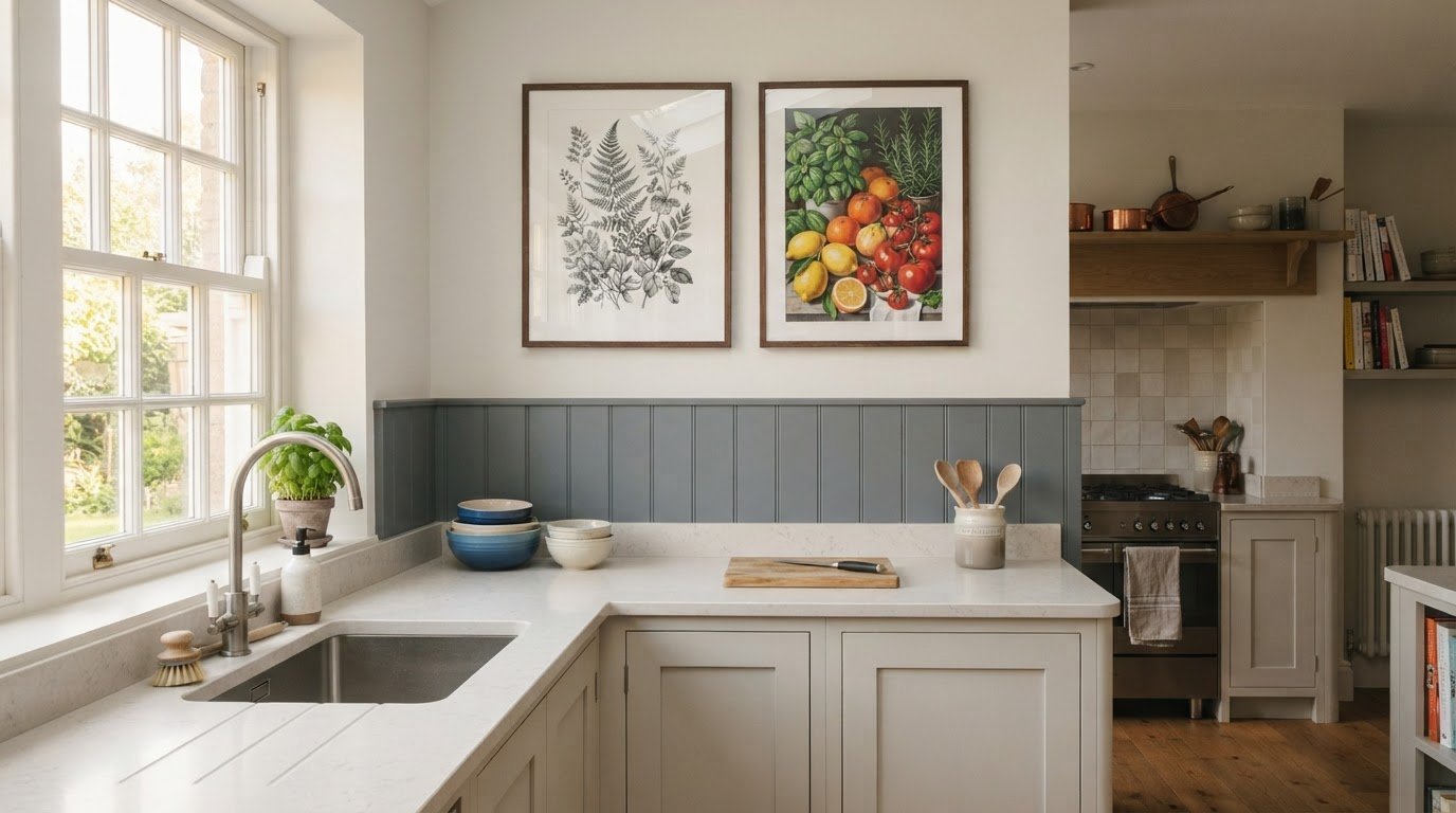
Bold food prints aren’t the only way to bring character to a humid kitchen. Choose kitchen wall art with the room’s moisture in mind: framed or canvas prints are recommended for extra protection, while acrylic is another suitable option. Good ventilation also makes canvas a practical choice.
Black-and-white artwork and nature scenes offer a calmer alternative to coffee cups, fruit and spice illustrations. They can echo colours and themes from other rooms, helping the kitchen feel connected to the rest of your home without losing its own personality.
In this guide, you’ll learn how to choose artwork with a kitchen’s humidity in mind, decide between food-inspired and nature-led designs, and create a look that feels at home around busy worktops and shared meals. Start with a mood you love, then choose a print style that suits the room.
Key Takeaways
- Match the print style to your kitchen’s moisture levels and ventilation for a look that suits the room.
- Use coffee, fruit, vegetables or spices to bring a familiar, flavourful touch to your walls.
- Try black-and-white or nature-inspired designs to create a calmer link with the rest of your home.
- Choose food illustrations to give an open-plan cooking area its own visual identity.
- Explore popular styles and learn how abstract, wildlife and other canvas prints can help shape your kitchen’s feel.
Print suitability for humid kitchens
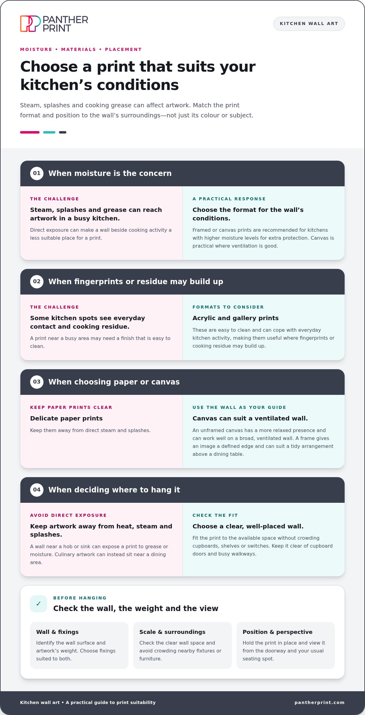
Steam, splashes and cooking grease can affect artwork in a busy kitchen. Panther Print recommends framed or canvas prints for kitchens with higher moisture levels for extra protection. Canvas is a practical choice where ventilation is good. Choose the format for the wall's conditions, not just its colour or subject.
Acrylic and gallery prints are easy to clean and can cope with everyday kitchen activity. That makes them useful near areas where fingerprints or cooking residue may build up. Kitchen-themed prints can feature coffee cups, herbs, fruit or familiar utensils. Keep delicate paper prints away from direct steam and splashes.
Sayings add personality without relying on a detailed image. A short line about coffee or cooking can sit neatly beside a breakfast nook. Choose lettering that stays legible against the background, then echo a colour from your cabinets. Culinary prints, such as illustrated lemons or spice jars, bring a clear food-inspired touch.
Framed and unframed prints create different looks. A frame gives an image a defined edge and can suit a tidy arrangement above a dining table. An unframed canvas has a more relaxed presence and can work well on a broad, ventilated wall. Match the finish to the room's practical needs.
What size wall art works best in a kitchen? Choose a piece that fits the clear wall space without crowding nearby cupboards, shelves or switches. On a narrow wall, a smaller print can feel balanced; above a table, choose a scale that relates to the furniture.
How do I choose kitchen wall art to match my colour scheme and cabinets? Pick out a colour from a cabinet or worktop, then repeat it in the print. For example, pair green cabinetry with botanical leaves, or use a black-and-white image for contrast against pale cupboards.
What are the best kitchen wall art ideas for small kitchens? Try a compact coffee illustration, a simple fruit print or a short typographic saying. A single image keeps a small wall clear, while a coordinated pair can use vertical space beside a pantry.
How do I hang kitchen wall art safely and securely? First, identify the wall surface and the artwork's weight. Choose fixings suited to both, and keep the print clear of cupboard doors, shelves and busy walkways.
Can kitchen wall art be placed above a hob or sink? Choose a wall away from direct heat, steam and splashes. These areas can expose a print to grease or moisture, so place culinary artwork near a dining area instead.
Before hanging, hold the print in position and check it from the doorway and your usual seating spot. This helps you judge its scale, colour and distance from cooking activity. A well-placed image adds character without getting in the way of daily kitchen tasks.
Coffee, fruit, vegetables and spices
Coffee-themed artwork brings a familiar ritual into the room. Choose a steaming mug, espresso cup or coffee beans to suit your routine. A close-up illustration feels lively, while a simple line drawing keeps the wall calm. For a personal touch, echo the colour of your favourite mug or coffee tin. This small visual link helps the print feel chosen, not simply added.
Fruit and vegetables offer colour without relying on lettering. Lemons, pears, tomatoes and artichokes each bring distinct shapes and shades. Match the artwork to a detail already in your kitchen, such as a green tile or a red kettle. Alternatively, use a bright fruit illustration against neutral cabinets for a clear focal point. Keep the surrounding wall uncluttered so the image remains easy to notice.
Spice illustrations can bring warmth and pattern to a cooking space. Paprika, turmeric, cinnamon and peppercorns provide rich colour cues. A single jar illustration suits a narrow wall, while a row of spice drawings can fill a longer stretch. Look for a consistent drawing style and background tone. This helps a coordinated display feel distinct from a collection of unrelated images.
Before choosing a subject, decide what the wall should do. A coffee print can mark a breakfast corner. A vegetable illustration can soften a plain wall beside a dining table. For an open-plan kitchen, repeated food imagery can help distinguish the cooking area from the lounge. Use one main print, then add smaller pieces only if they leave enough breathing room.
- For a quiet look: choose one fruit or coffee illustration with a pale background.
- For a colourful wall: pair citrus, tomatoes or spice tones with a matching room accent.
- For a playful touch: mix food illustrations with a short, easy-to-read saying.
- For a joined-up display: keep the subject, palette or illustration style consistent.
Check the artwork against nearby details before settling on it. Hold a colour sample beside the print, or compare it with cabinet doors in daylight and evening light. Notice whether the image competes with patterned tiles or busy worktops. If the kitchen already has strong patterns, a simple coffee cup or single piece of fruit can provide a visual pause.
Choose a food-led print that reflects how you use the space, from a morning coffee spot to a family cooking area. For a coordinated food-inspired feel, explore coffee and olive-inspired prints alongside your chosen palette.
It can suit a breakfast corner or a wall near the coffee-making area, especially if its colours echo a mug or another small kitchen detail. Leave room around the image so it reads as a deliberate focal point rather than part of a crowded display.
Its food-led subject can sit naturally alongside fruit, vegetable or spice artwork when the pieces share a palette or illustration style. Before arranging a group, compare the prints with nearby tiles and cabinets, then leave clear space around the display. A restrained selection can bring warmth to the kitchen without competing with patterned surfaces or busy worktops.
Black-and-white and nature designs
Black-and-white prints bring clear contrast without adding another colour to the room. A monochrome photograph of a herb sprig, orchard branch or country lane can suit both modern and traditional kitchens. Choose a subject that connects with nearby details, such as wooden shelves or dark cabinet handles. The image then feels tied to the room, not simply placed on an empty wall.
Nature designs offer a softer way to add visual interest. Consider fern leaves, wildflowers, olive branches, birds or rolling hills. A botanical print can echo real plants on a windowsill, while a landscape can bring an open view to a kitchen with limited outlook. Keep the subject in step with your décor. Fine-line leaves suit a pared-back room; a bold wildlife image adds more presence.
These two directions can also link the kitchen with adjoining rooms. Repeat a black frame, leafy subject or simple monochrome palette in the hallway or dining area. The shared detail creates continuity without making every wall look identical. For an open-plan home, choose one feature that appears in both spaces, then vary the artwork’s subject or scale.
Use contrast deliberately. A black-and-white print stands out against pale walls, while a light image can lift a darker wall. Nature artwork works with both approaches: a detailed woodland scene gives depth, and a single leaf illustration keeps the look simple. Compare the print with cabinet fronts and worktops before choosing. This helps you spot competing patterns and colours.
- For a calm wall: choose one delicate fern or leaf drawing.
- For a strong focal point: select a high-contrast bird or landscape photograph.
- For an open-plan link: repeat one natural subject in the kitchen and dining area.
- For patterned tiles: use a simpler monochrome image to balance the detail.
Try a quick layout before hanging anything. Hold your chosen print beside the wall, then view it from the doorway and dining chair. Check whether its dark areas sit comfortably beside cabinet handles, appliances or a table. A black-and-white image can tie those details together; a nature scene can add a fresh note without introducing a busy palette.
Finally, choose a subject you’ll enjoy seeing during ordinary routines. A familiar British woodland, a close-up leaf or a calm coastal view can make the kitchen feel more personal. Keep the surrounding display restrained, especially if shelves already hold plants, mugs or cookbooks. One well-chosen print can create a visual pause between those everyday objects.
Black-and-white prints or nature imagery can create a thematic connection between the kitchen and other rooms, helping the artwork feel related across the home.
Food and fruit illustrations
A food illustration can give a kitchen its own visual identity. Think of a lemon, pear, tomato or loaf of bread. The subject feels familiar, yet its drawing style changes the mood. A loose watercolour lemon feels softer than a crisp, graphic tomato. A detailed pear illustration can bring a traditional touch. Choose an image that suits the room’s character, rather than matching every object on display.
Colour sets the pace. Red tomatoes and green leaves create a lively focal point against a plain wall. A muted illustration of pears can sit more quietly beside painted cabinets. Pick a shade from the image, then repeat it in a tea towel, bowl or small accessory. This creates a simple visual link without turning the whole room into a colour scheme built around one print.
Illustration style matters as much as subject. Vintage market-inspired fruit drawings can complement wooden shelves and well-used kitchen tools. Clean outlines feel at home with smooth cupboards and simple handles. A hand-drawn bunch of carrots adds a playful note, while a botanical-style artichoke can feel more grown-up. Keep the line quality and background tone consistent if you’re displaying several pictures together.
In an open-plan home, culinary images can help distinguish the cooking area from the living space. Try a fruit print near the dining table or a set of vegetable illustrations beside the kitchen zone. Let the subject mark the change in use, then keep the adjoining room’s artwork different. A shared accent colour can still connect both areas without making them feel identical.
- For a fresh look: choose lemons, herbs or green pears.
- For a richer palette: try tomatoes, plums or aubergines.
- For a rustic feel: look for bread, market produce or hand-drawn vegetables.
- For a tidy display: repeat one illustration style across the group.
Before choosing a print, notice the shapes already in the room. Round fruit can echo plates or pendant shades. Long carrots or stalks can complement narrow shelves and vertical tiles. Then consider the wall’s distance from the dining area. A bold bunch of produce can anchor a larger stretch, while one small pear illustration suits a narrow space beside a cupboard.
Food imagery works best when it reflects the kitchen’s everyday feel. A coffee pot can suit a breakfast corner; a bowl of plums can bring colour near a table. Choose a subject you enjoy seeing, then give it enough clear wall space to stand out. The result feels personal, cheerful and connected to the way you use the room.
What styles of kitchen wall art are popular in the UK?
UK kitchens bring together many decorating tastes, so choose a style that suits your home rather than chasing a single trend. Monochrome prints, nature scenes, food illustrations, typography and abstract designs each offer a distinct feel. Start with the room’s colours, materials and daily use. Then choose artwork that adds something useful, such as contrast, warmth or a personal detail.
Black-and-white imagery suits kitchens with strong existing colours or patterned surfaces. A monochrome photograph of a British coastline can sit comfortably beside colourful tiles. A simple line drawing also gives a quieter wall definition. Repeat a black frame or dark detail elsewhere, such as cabinet handles, to make the artwork feel connected to the room.
Nature-inspired designs bring an organic touch. Choose wildflowers, fern leaves, birds or a landscape to complement wood, stone and indoor plants. A landscape print can introduce an open view, while a floral image adds softer shapes. For a cohesive scheme, pick a colour from the artwork and repeat it in a tea towel or vase.
Food and drink imagery feels at home near dining areas and breakfast corners. Coffee illustrations, fruit studies and spice drawings can make a cooking space feel welcoming. Typography offers another personal option: a short phrase about coffee or cooking can add humour. Keep lettering clear and readable, especially on a small wall or amongst busy shelves.
Abstract designs suit kitchens that need colour without a literal food subject. Look for shapes that echo the room, such as curved forms beside round pendant lights. Floral prints bring a softer pattern, while landscapes add depth. Photographic artwork can show a favourite place or ingredient with realistic detail. Match the image’s mood to the way you want the kitchen to feel.
- For a modern room: try monochrome photography or bold abstract shapes.
- For a country-inspired kitchen: consider wildflowers, birds or a gentle landscape.
- For a sociable dining corner: choose coffee imagery, fruit or readable typography.
- For a colourful focal point: pick a floral print with one shade echoed nearby.
Before choosing, compare the artwork with cabinets, worktops and nearby rooms. In an open-plan layout, repeat a colour or subject from the living area. In a smaller kitchen, let one clear image lead rather than mixing competing styles. Browse a few themes, shortlist the ones that suit your home, then choose the image you’ll enjoy seeing every day.
Panther Print: Abstract Canvas Prints
Panther Print offers Abstract Canvas Prints for kitchens that need colour, movement or a less literal focal point. Choose an abstract design when fruit, coffee and botanical imagery don’t suit your taste. Animals & Wildlife can bring a nature-led touch, while Black & White Prints offer quieter contrast. Art for Kids & Nursery Art and Banksy Canvas Prints provide other distinct directions for family spaces or bolder rooms.
Start with the wall’s colours and the mood you want. Look for shapes that echo nearby details, or choose a print that adds contrast to plain cabinets. This makes browsing easier and helps narrow your choice to artwork that feels at home in your kitchen.
Explore Panther Print’s canvas prints and choose a style that feels right for your space.
Make your kitchen feel more like you
Let the room reflect the way you live, not just the way it’s decorated. A print can capture a favourite mood, add a personal detail or bring a little energy to an everyday corner. Choose kitchen wall art that feels at home alongside your routines, then let it inspire the finishing touches around it.
For a bolder focal point, Panther Print offers Abstract Canvas Prints. Animals & Wildlife can bring a nature-led touch, while Art for Kids & Nursery Art offers playful inspiration for a family space. These different styles make it easier to carry your taste through the home without making every room look the same.
Ready to find artwork that feels right for your space? Contact Panther Print to explore ideas for your walls. Pick a design you’ll enjoy seeing each day, and give your kitchen a personal finishing touch.
Frequently Asked Questions
What materials are suitable for kitchen wall art near heat, steam and splashes?
Acrylic is a practical option for humid areas, while framed or canvas prints suit kitchens needing extra protection. Keep any artwork away from direct hob heat and regular water splashes, which can affect its surface over time. Near a sink, choose a spot outside the usual splash zone. Above a cooker, place the print on a separate wall instead of directly over the hob.
How can I protect kitchen wall art from grease and moisture?
Reduce exposure first: position prints away from cooking splatter, steam and the sink. Use an extractor fan or open a window while cooking, and wipe nearby surfaces before grease settles. For light dust, use a clean, soft cotton or microfibre cloth. Avoid harsh chemicals on printed surfaces. If you notice condensation building on a wall, move the artwork to a drier position.
Is framed or canvas wall art better for a kitchen?
Neither suits every kitchen; the wall’s ventilation and exposure matter most. A framed print can provide an added protective layer, whilst canvas works well in a ventilated area. Choose framed artwork if you want a defined border that echoes cupboard lines. Canvas offers a softer, borderless look. In either case, place the piece away from persistent steam, splashes and cooking grease.
How much does kitchen wall art cost in the UK?
Prices for kitchen wall art in the UK vary depending on the size, finish and supplier you choose. At Panther Print, options typically range from affordable smaller prints starting around £10 to £20, up to larger canvas or framed pieces costing £40 or more, making it easy to find stylish decor to suit any budget.