
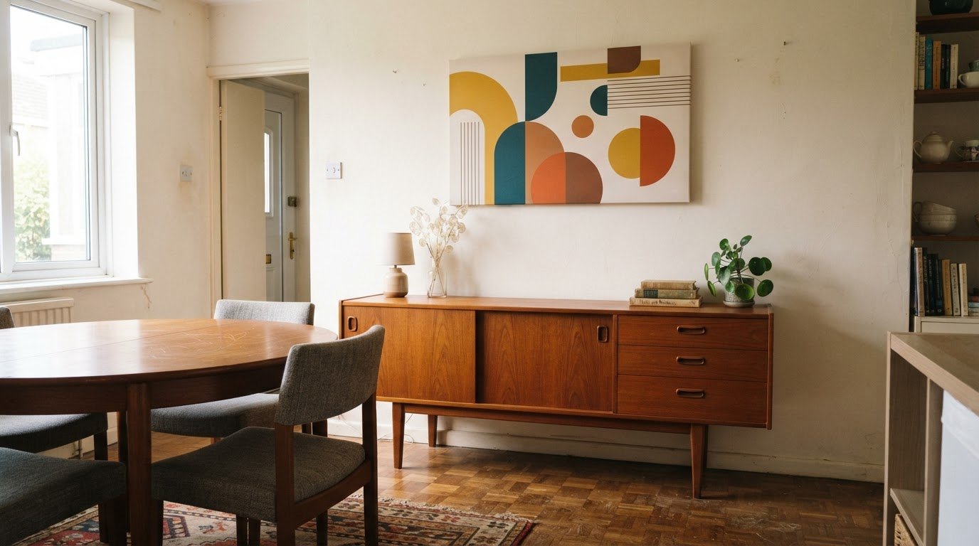
What if one bold canvas could bring a whole room together? Mid-century modern canvas art takes inspiration from design of the 1930s to mid-1960s, pairing clean geometry, abstract forms and confident colour for a look that feels both playful and considered.
It’s easy to see the appeal of mid-century modern canvas art: mustard, teal, burnt orange and warm brown can lift a room, while softer shapes and neutral tones keep it calm. The right print also depends on where it will hang and how it works with your furniture.
Here, you’ll learn what defines the style, how to place geometric and abstract designs in living rooms, bedrooms, dining areas and home offices, and what influences canvas print prices. You’ll also find practical sizing guidance to help choose artwork that feels balanced on your wall, whether you’re refreshing one corner or giving a room a stronger focal point.
Key Takeaways
- Look for clean geometric shapes, abstract forms and warm, confident colours to capture the mid-century look.
- Choose canvas width in proportion to the furniture beneath it, then leave a clear gap above the piece.
- Use a bold geometric print to give a room a focal point, or choose softer shapes for a calmer feel.
- When planning your budget, consider the artwork’s size and style, then explore the price details for the print you like.
Artwork placement in living rooms, dens, offices and dining areas
Choose artwork in relation to your furniture, available wall space and light. A well-sized canvas can help connect a room’s furniture and colour scheme.
Placement by room
In a living room or den, place a focal print above the sofa or credenza, centred in relation to the furniture below. In an office, use a clear wall behind the desk or in your main sightline. Above a dining sideboard, choose art that suits its width. Echo walnut, brass or leather with warm tones, or use orange as a lively accent.
Choosing artwork size
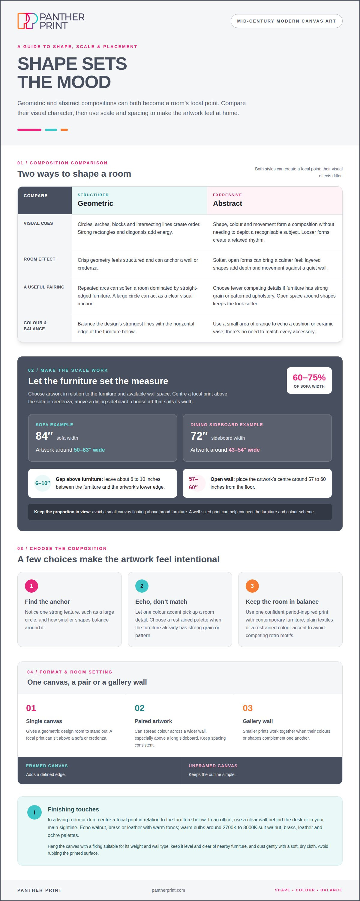
Above a sofa, a commonly recommended width is 60% to 75% of the sofa’s width. For an 84-inch sofa, that means artwork around 50 to 63 inches wide. A 72-inch dining sideboard usually pairs with artwork around 43 to 54 inches wide. Avoid a small canvas floating above broad furniture. For an open wall, place the artwork’s centre around 57 to 60 inches from the floor.
Choosing canvas formats and pairings
A single canvas gives a geometric design room to stand out. Paired artwork can spread colour across a wider wall, especially above a long sideboard. Smaller prints also work together as a gallery wall when their colours or shapes complement each other. A framed canvas adds a defined edge, while an unframed canvas keeps the outline simple. Keep spacing consistent between paired pieces.
Original art is a one-off work created by an artist; handmade describes how an artwork or its components are made. Printed canvas reproduces an image onto canvas, so the design can be produced in multiple copies. For high-resolution visual reproduction and bespoke display solutions, commercial specialists like printitza.co.za illustrate how advanced litho and digital techniques achieve sharp detail and consistent colour fidelity across different materials.
Hang a canvas with a suitable fixing for its weight and wall type, keeping it level and clear of nearby furniture. Dust gently with a soft, dry cloth, and avoid rubbing the printed surface.
Leave about 6 to 10 inches between furniture and the artwork’s lower edge. Warm bulbs around 2700K to 3000K suit walnut, brass, leather and ochre palettes. Choose a bold print that balances the furniture, rather than filling the wall with competing retro motifs.
Geometric and abstract compositions
Geometric designs create order with circles, arches, blocks and intersecting lines. Abstract compositions use shape, colour and movement without needing to depict a recognisable subject. Both can give a room a focal point, but their visual effects differ: crisp geometry feels structured, while looser forms create a more relaxed rhythm.
Start with the feeling you want. Repeated arcs can soften a room dominated by straight-edged furniture. Strong rectangles and diagonal lines can add energy beside a plain wall or simple shelving. Look for a clear visual anchor, such as one large circle, and notice how smaller shapes balance around it. This helps the artwork feel intentional rather than busy.
Use colour to connect the print with the rest of the room. A small area of orange, for example, can pick up a cushion or ceramic vase without matching every accessory. If your furniture has strong grain or patterned upholstery, choose an abstract design with fewer competing details. Layered shapes can add depth and movement against a quiet wall.
Scale matters for geometric artwork. Large living rooms and open-plan spaces may suit formats such as 30 by 60 inches or 36 by 72 inches. A broad geometric composition above a credenza can anchor the room and make the furniture feel connected to the wall. Keep the design’s strongest lines balanced with the credenza’s horizontal edge.
To avoid an overly retro effect, use one confident period-inspired print rather than filling every surface with competing motifs. Pair it with contemporary furniture, plain textiles or a restrained colour accent. For a softer look, choose an abstract canvas with open space around its shapes. Browse abstract canvas prints for designs that bring geometry or expressive forms into your room.
Definition and visual characteristics of mid-century modern wall art
Mid-century modern design is associated with roughly the 1930s to the mid-1960s. Its wall art draws inspiration from vintage furniture designs from the 1940s up to the 1960s, a connection often explored by vintage specialists like The Mid Century Design Co.. That overlap gives prints a streamlined yet familiar feel. The style refers to a broad design period, not one exact look or year.
Look for clean geometry, bold colour and motifs associated with the 1950s and 1960s. A print might combine a half-circle, repeated stripes and a block of cream. Simple forms make the design easy to read across a room. Curved shapes beside straight lines add contrast without relying on a recognisable subject.
The palette might include mustard yellow, avocado green, burnt orange, teal, warm brown and cream. These colours can appear in broad areas, small accents or contrasting outlines. Teal against cream feels crisp; burnt orange with warm brown creates a richer impression. A print can use just a few of these shades and still suggest the period.
To recognise a focused style reference, consider the shapes, colours and overall mood together. Clean forms and a limited palette create a different effect from busy imagery with competing motifs. Abstract designs can suggest the era through colour and composition without depicting vintage furniture or scenes, making them easier to pair with contemporary surroundings.
Before choosing, notice which visual cue appeals most: curved forms, strong lines or warm colour. Then consider whether the image feels balanced from across the room and up close. Mid-century modern wall art should have a recognisable design character, but it doesn’t need to reproduce a historic image. This helps distinguish period-inspired art from decoration that simply looks old-fashioned.
Mid-century modern canvas print prices
There isn’t one price for every mid-century print. The amount depends on the chosen design, its dimensions and whether you’re buying one canvas or a set. A compact print and a large statement piece use different amounts of material. Compare like with like: check the same format and size before weighing up options.
Size is a practical starting point. A wide 30 by 60-inch canvas needs more material than a smaller format, and it may suit a broad wall better. Larger sizes such as 36 by 72 inches can make a strong feature in open-plan rooms. Choose a scale that fits the space, rather than paying for a format that overwhelms it.
Design can also affect how you judge a print’s visual impact. A simple geometric print may rely on a few clean shapes, while a detailed abstract composition can use layered colour and fine lines. A coordinated pair gives you two pieces to arrange together. Decide whether one central artwork or a connected set better suits your wall.
Before buying, check the displayed size, orientation and image preview. These details show whether the artwork’s proportions and composition suit your space. Don’t judge quality from a thumbnail alone. Enlarge the preview, where available, and inspect fine lines, edges and colour transitions. Look for clear detail without visible pixelation or blurred shapes.
Read the product description for the format and what’s included. Panther Print canvases are printed on archival-grade canvas, stretched and gallery-wrapped on a frame. Check the exact dimensions and compare like with like when considering different designs. This gives you a clearer basis for choosing artwork that suits your wall.
For a sensible budget, shortlist designs first, then compare their available sizes and formats. The best choice balances the amount you want to spend with the wall space and visual impact you need. A carefully sized canvas with crisp, legible detail can serve its purpose better than a larger piece that doesn’t suit the room.
Panther Print: Pop Art / Modern Art
Once you’ve settled on a bold, modern look, Panther Print gives you a practical next step: explore Pop Art / Modern Art for graphic impact, or browse Abstract Canvas Prints for shapes and colour that suit your room.
For a different space, Animals & Wildlife can bring character to a living area, while Art for Kids & Nursery Art offers a playful option for a child’s room. Compare each design’s subject, colours and composition with your furniture, then use the sizing guidance above to narrow your choice. A clear favourite can help you decide between a striking focal point and a quieter accent.
Contact Panther Print to discuss your canvas art options.
Choose the wall that sets the mood
Start with one wall you’d like to change. Decide whether you want it to add energy, soften a busy corner or give a quiet space more personality. Then choose a design that feels like you, rather than one that simply matches everything already in the room. Mid-century modern canvas art can inspire a fresh colour choice or a more confident focal point.
Once you’ve chosen your print, carry one detail through the space. Pick a colour from the artwork for a cushion, vase or lampshade, and keep other surfaces calmer. This gives the room a considered feel without turning it into a themed display. Take time to choose both the image and the wall where it will hang.
Ready to explore the next step? Contact Panther Print about canvas art and start shaping a room that feels more personal. A thoughtful choice can bring a new spark to your home.
Frequently Asked Questions
What exactly is Mid-Century Modern art?
Mid-century modern art reflects the clean, practical design spirit of the mid-century period. It often favours simplified forms, strong composition and a sense of movement over intricate detail. Mid-century modern canvas art might pair a sweeping curve with a sharply defined block, for example. The label describes a broad visual approach, so individual pieces can look quite different.
What defines mid-century modern canvas art?
Look for a deliberate balance of shapes, open space and colour, rather than an image crowded with decorative details. A design with an oversized arch and a small contrasting circle, for example, can feel recognisably modernist without copying a specific historic artwork or room. The canvas format presents that period-inspired composition as wall art, ready to bring a clear focal point to your space.
Which colours and motifs are typical of mid-century modern art?
Common motifs include sunbursts, arches, stylised leaves, dots and repeated lines. Colour combinations often set warm shades against cooler accents, or pair muted tones with one vivid detail. A simple fan-like sunburst can bring movement to a plain wall, while a few curved shapes create a softer effect. Choose motifs that echo, rather than compete with, nearby patterns.
How much does mid-century modern canvas art cost in the UK?
The price depends on the specific print and size, so there isn’t one price for every design. Compare the listed price for the exact canvas and dimensions you’re considering. A larger format and a smaller print aren’t like-for-like comparisons. Check the product details, then consider whether the size and visual impact suit your space.
How do I choose canvas art to suit a mid-century modern room?
Choose mid-century modern canvas art that complements one or two existing features, such as a curved chair, a wood finish or a coloured lampshade. If the room already has patterned upholstery, a simpler design can prevent visual clutter. In a plainer space, a stronger composition can add interest. Consider the viewing distance too: fine details should remain clear from where people usually sit.
What are the best frame styles for mid-century modern canvas art?
A clean-edged canvas suits this style’s uncluttered look, while an added ornate border may draw attention away from the artwork. Panther Print’s canvases are handmade in the UK and use warp-free, slim-but-solid 18 mm kiln-dried European pine framing. The canvas is stretched and gallery-wrapped, giving the artwork a neat edge that works with simple, modern interiors.